Brief Description
Dataxu helps marketing professionals use data to improve their advertising. Our software empowers you to connect with real people across all channels, including TV, capturing consumers’ attention when and where it matters most.
The Problem
The first iteration of the website was tested and users found difficulty understanding the dataxu product line offering.
A few pain-points include:
Information that is considered important was buried, as we focused on client testimonials and not our product line.
We needed to highlight and explain what our newest product was, with an option to dive deep.
We needed a better solution to lead the a prospect to our contact us form.
What We Found
There were two types of users, ones that reaches the product landing page from paid ads, and ones that come to the dataxu.com and try to navigate through the site.
As we were reviewing the user feedback and working through the content, we noticed that there were two types of users; ones that reaches the product landing page directly from paid and organic campaign ads, and others come straight to dataxu.com. Which ever user it was, there was clear need for simplicity and straightforward direction.
How we Found It
How did we get to our discoveries
Heat Map Tracking for 30 day period.
Micro Focus Group Testing.
Solution
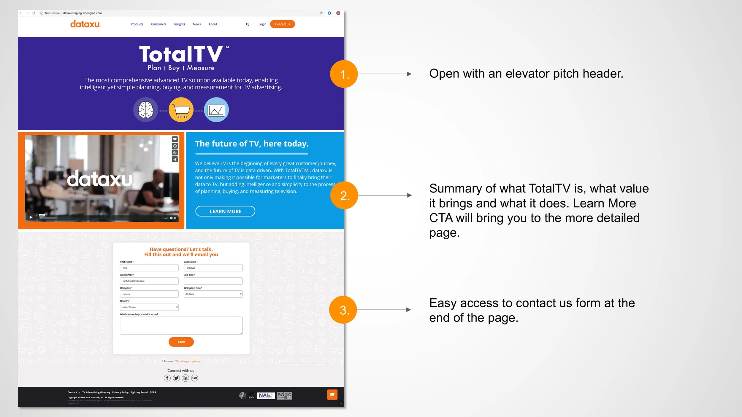
On the dataxu.com add a feature banner that tells you about the new product, which then leads to the product summary page.
2. Design product specific landing page that leads the user to:
a. watch a promo video that explains what the product is, what it can do for you.
b. read the summary of the product and/or go into learn more navigation that dives deep into product offering.
c. Go down the page and submit a contact us more form and a real life person will reach out to you.
My Role
I was brought in as the visual/UI lead and also worked on parts of the UX.
I designed the landing page - TotalTV summary page, full TotalTV product page, Banners, Paid and organic ads. Was in charge of branding, layout, wireframes, mocks, testing, heat map tracking, iconography and video art direction.
I used research findings to create solutions on how to create clear announcement of the new product on the homepage, start designing the product page summary as well as detailed page and create solutions to how a prospect could reach out to us easier.
Looking at the original design:
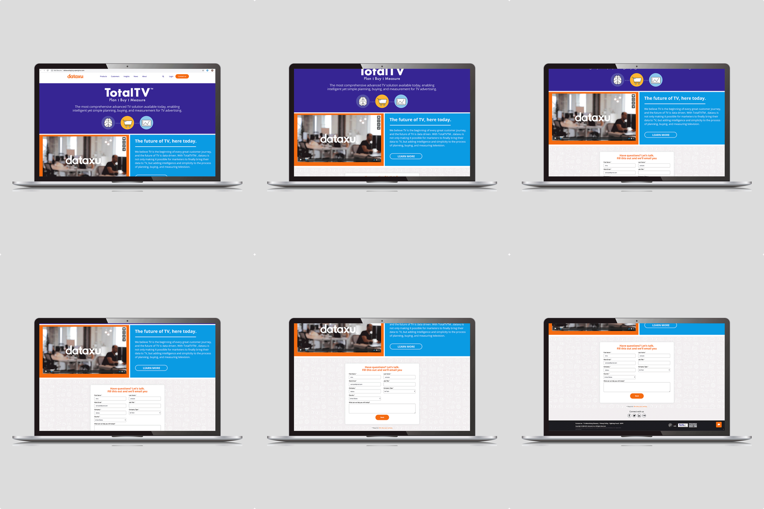
Since information that was considered important was often overlooked, because large images and client testimonials overpowered the landing page, we needed to create space for important announcements such as new product launch. We created a space for a top banner below the top navigation.
The original product landing page had all of the product offerings in one space, with information that was hard to digest. I broke the product offering page into each product summary page, that had snack-able easy to digest information that leads the user to either wanting to dive deep into the product, or to fill out the contact us form.
The Contact Us form could only be accessed through top navigation button, which we found to be a huge missed opportunity. To improve that, we added a contact us form at the bottom of the product summary page, and product detail page. The new placement and size of the form allows for better visibility and legibility. We saw 150% higher engagement from previous 3 months.
The landing page showcased above, was one of big puzzle pieces that tied everything together. Bellow you can see a snippet of two part campaigns such as “Emmy Botox Sweepstakes” and “TotalTV Launch Party” which in result in achieving over 700 qualified leads in the first 2 weeks, lots of PR buzz and an acquisition.


